Leyla Məmmədova
34 · Bakı
Kredit Sığortası
When I took out the loan I got insured too. I downloaded the app, but my contract isn't there. To know how long it's valid, I have to call every single time.
No access to the app
After the release, besides our core product HYS, we managed to bring customers of our other products into the mobile app:
The previous app architecture focused on a single product — Life Insurance (HYS) contracts. Despite the company's rich insurance portfolio, customers could not see any other products inside the app.
Take the app beyond its limited scope and turn it into a fully functional multi-product platform, giving users the ability to manage all their insurance products in one place.
After extensive brainstorming and team discussions, we decided not to settle for cosmetic changes. Instead, we re-designed the app's UX architecture from scratch with a large-scale redesign.
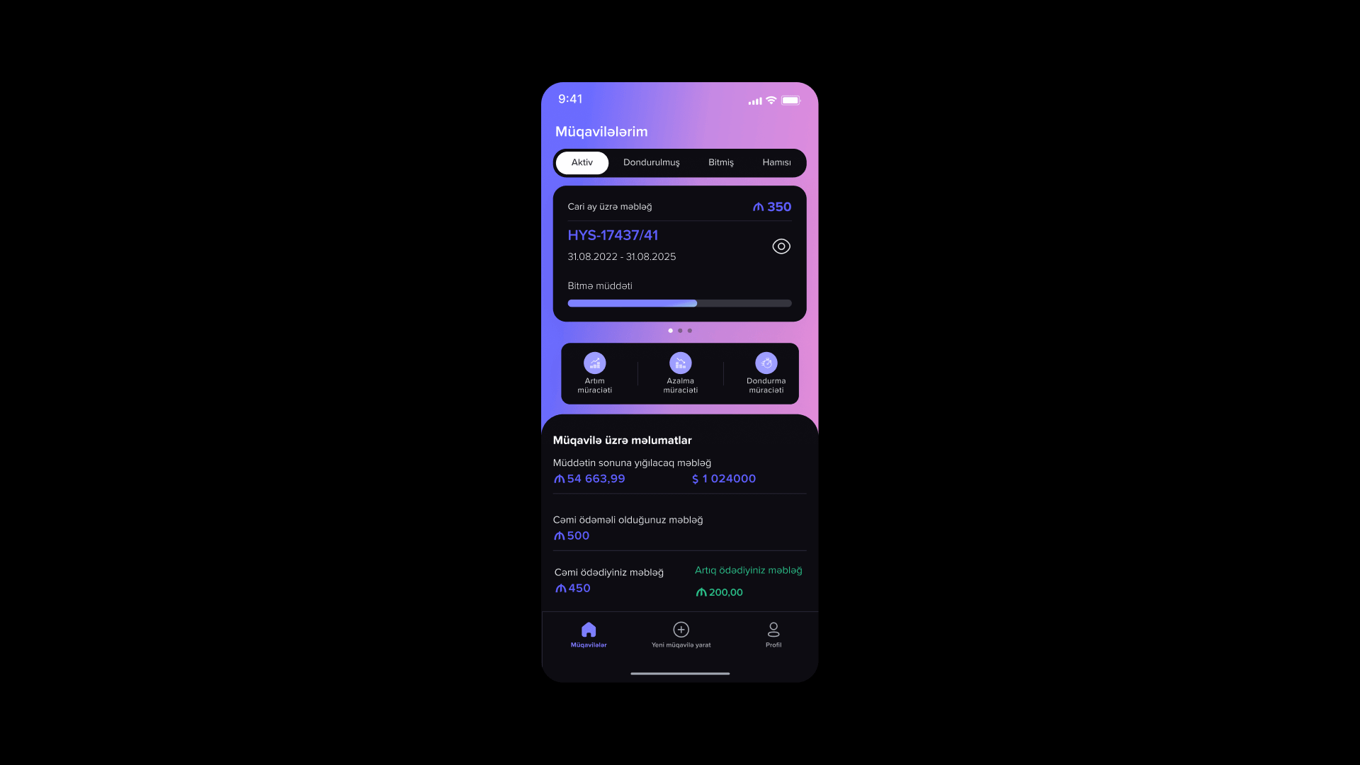
The previous app — built around a single HYS contract.
Customers who held any product other than HYS — credit, mortgage, corporate or mandatory life insurance.
They had no access to the mobile app and could not see the details of their own contract. To check a term or a status, the only way was to call the call center.
Leyla Məmmədova
34 · Bakı
Kredit Sığortası
When I took out the loan I got insured too. I downloaded the app, but my contract isn't there. To know how long it's valid, I have to call every single time.
No access to the app
Rəşad Quliyev
41 · Sumqayıt
Korporativ Həyat Sığortası
My employer insured us, but I don't know what coverage I have. I open the app — it's empty. As if I'm not a customer.
Contract details hidden
Illustrative quotes — names are fictional.
Before designing our own solutions, I analyzed the global market leaders that manage multi-product structures.
By studying how fintech giants like Revolut simplify complex ecosystems, we identified the most effective UX patterns.
We adapted global standards to our internal business requirements and shaped a comfortable, scalable architecture model.
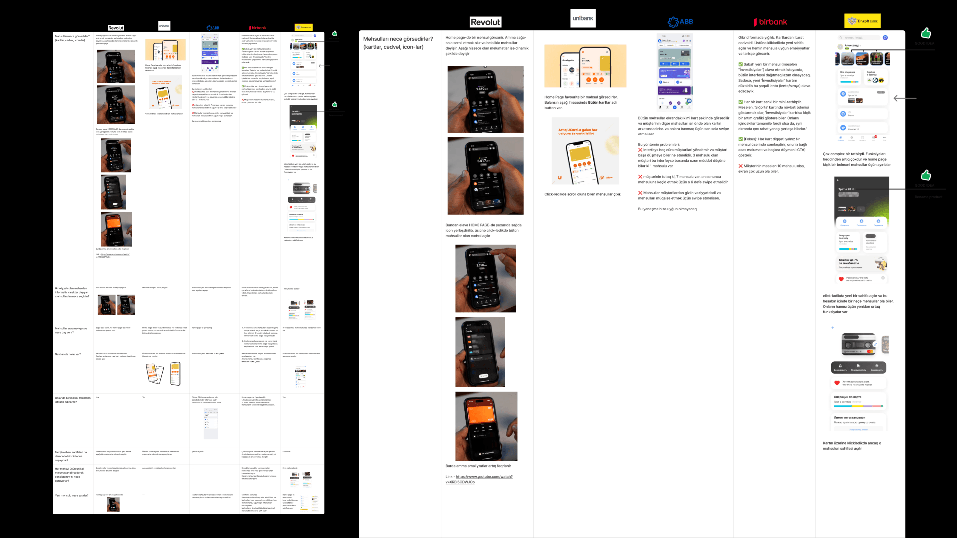
Benchmark: Revolut, Unibank, ABB, Birbank and Tinkoff compared side by side.
To test ideas, I designed 2 different wireframe concepts.
I analyzed the UX advantages and risks of each option separately.
To make discussion with the team easier, I placed all notes directly on top of the screens.
We chose Concept 02. Contracts scroll horizontally, with the operations and contract information placed right below them.
This approach was more familiar to our customers. They had been using the app for 2 years, and a user experience had already formed around it.
It was a risk-free choice for our high NPS scores — we could grow the app without breaking what users already liked.
Architecturally, everything was right — the structure scales naturally to more products.
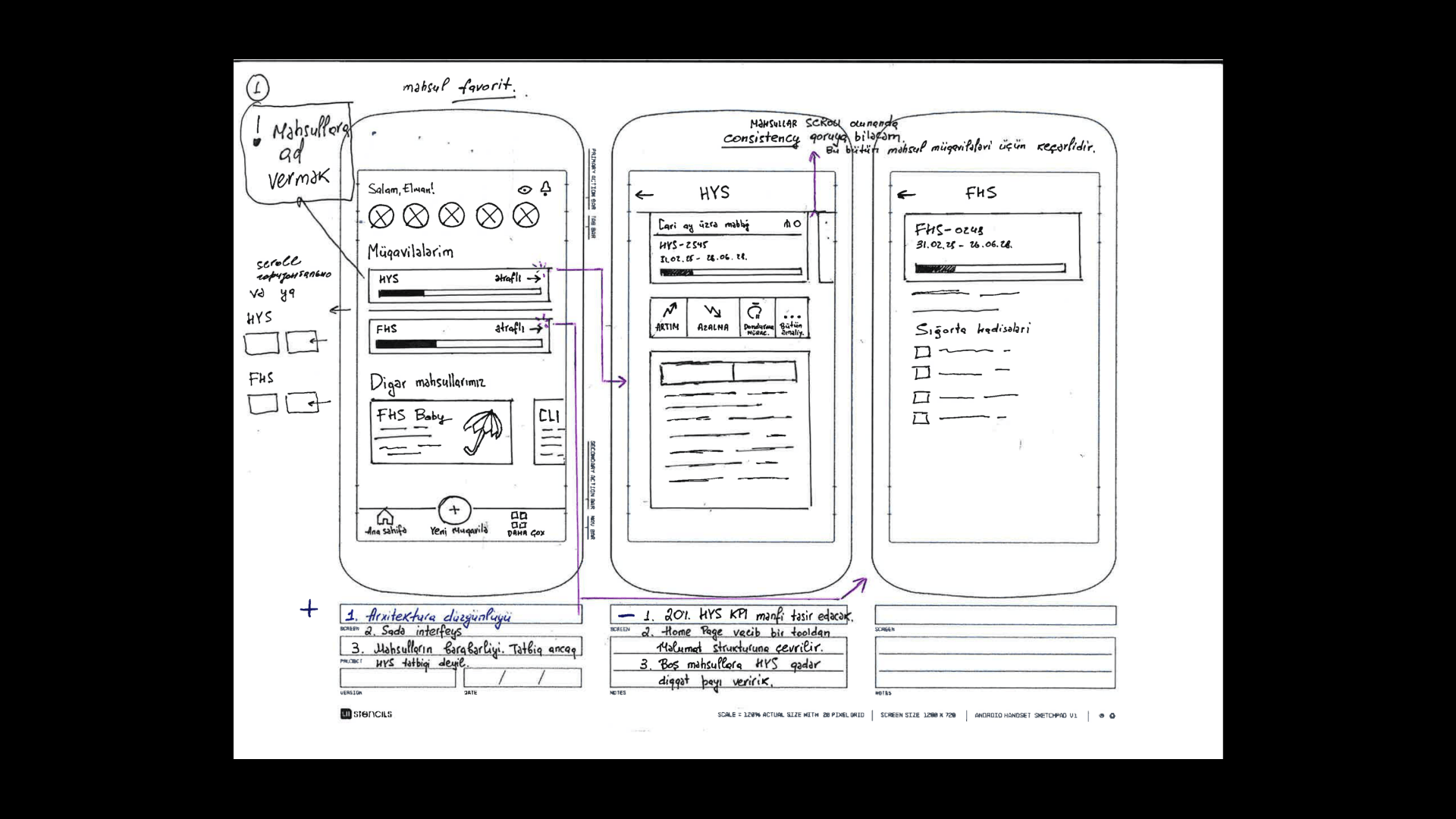
Concept 01
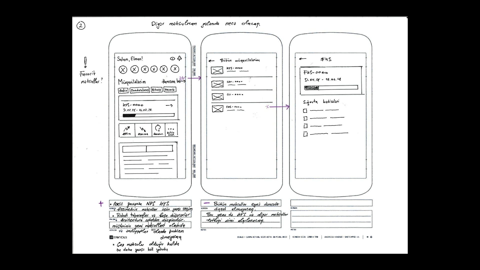
Concept 02✓ Selected
Based on the tested wireframes, I completed the new visual concept of the app.
We built a scalable design system with a modern aesthetic and a clear visual hierarchy.
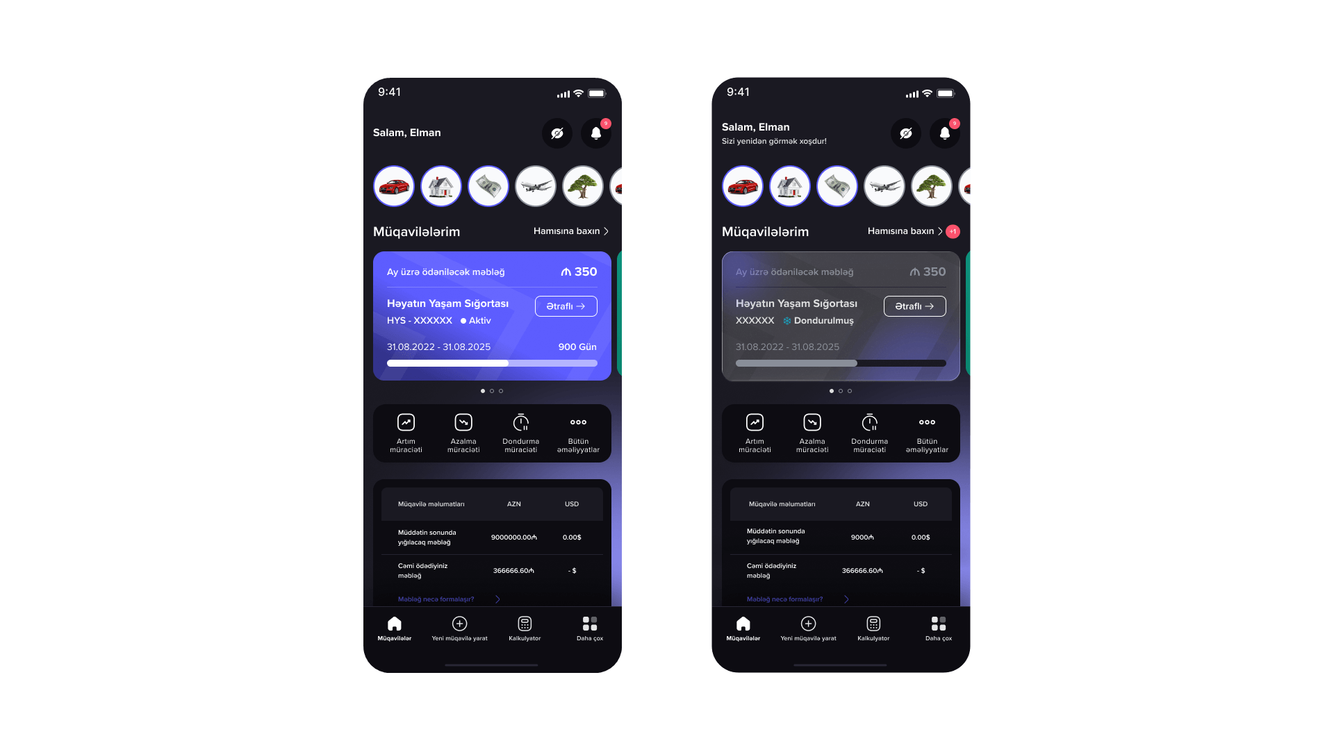
Final home screen — active and frozen contract states.
Interface text · Azerbaijani → English
The foundation is 80 color primitives — 8 palettes with 10 steps each. Nothing in the interface uses a raw color.
On top sit 24 semantic tokens — surface, label, divider, status, indicator, info. Each one has a Light and a Dark value, so switching the theme just re-maps tokens to different primitives.
Every product state — active, frozen, ended, cancelled, pending — has its own status token, and product accents such as the HYS violet live in their own tokens.
Hover a swatch
Həyatın Yaşam Sığortası
Müqavilə № 482915
500 gün qalıb
Çatışmayan sənəd var
Surface
Label
Divider
Status
Indicator
Info
Button · Blur
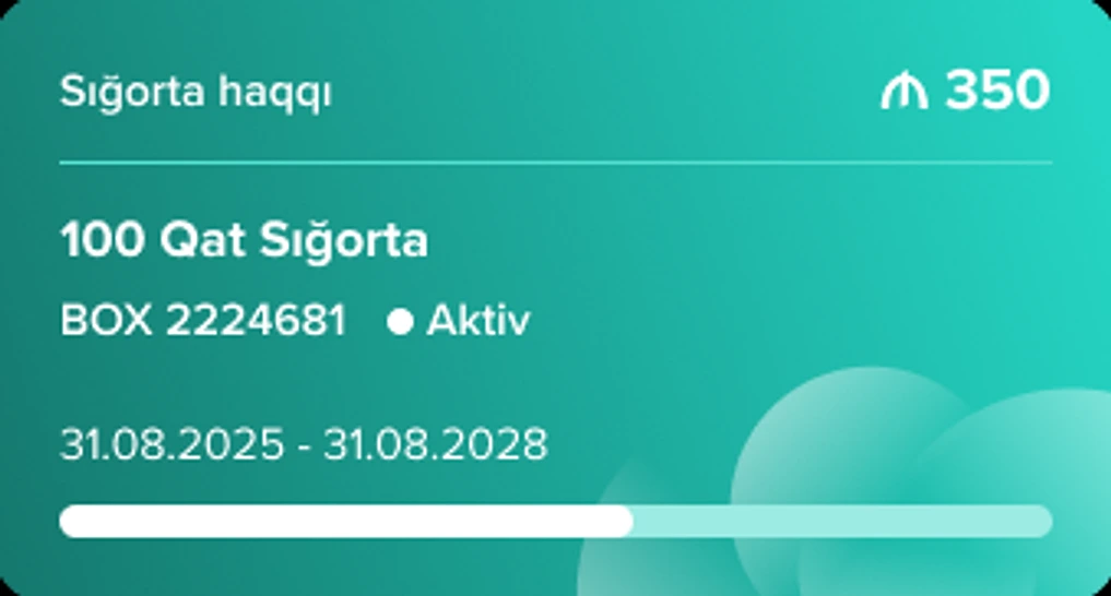
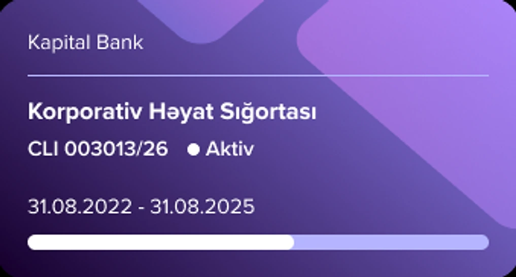
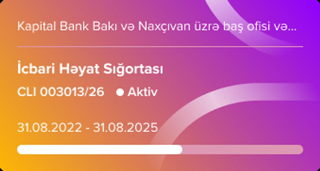
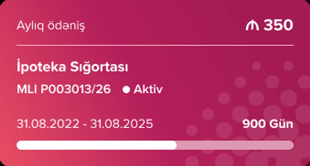
A single card design was not enough to represent products with such different parameters.
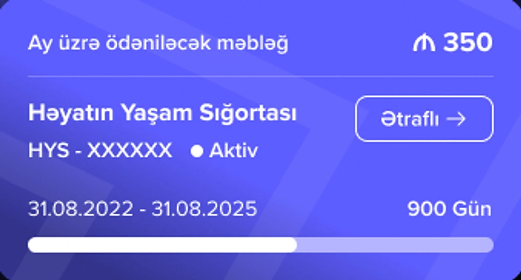
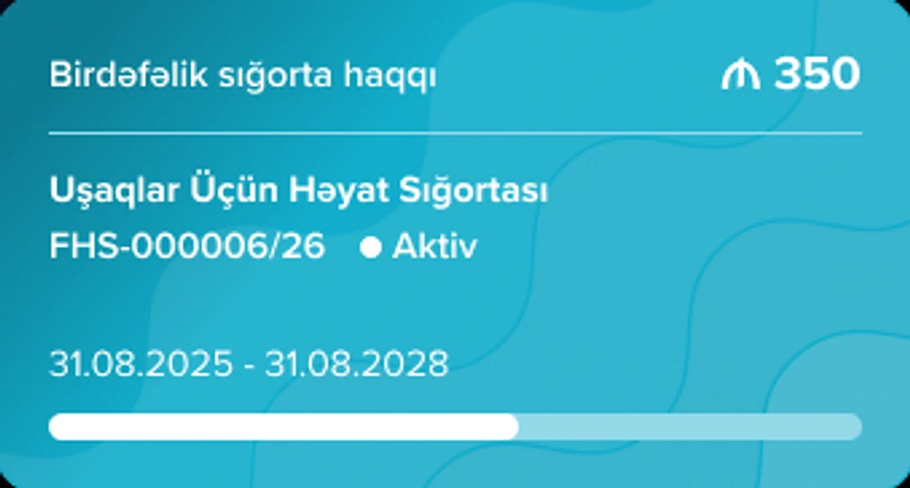
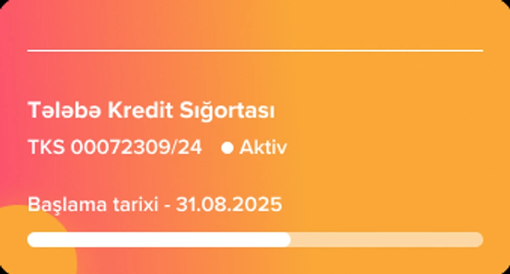
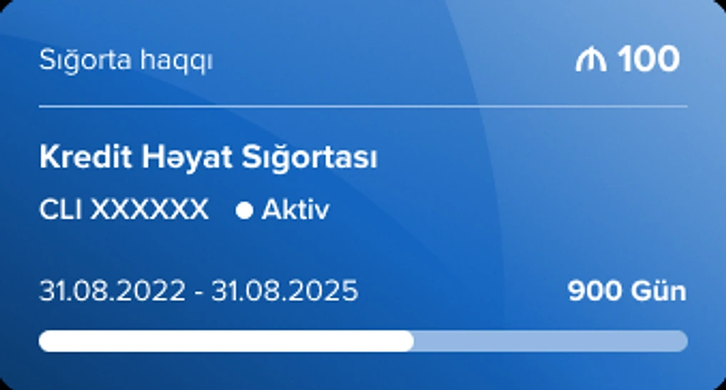
I built a visual system that identifies products by color — while scrolling, users instinctively understand which product contract they are looking at.
Card system — one color per product
In motion — scrolling between products
For users with many contracts, horizontal scrolling meant lost time and user fatigue.
By introducing the "View all" feature, we shortened the navigation distance — users now reach any contract in just 2 clicks.
"View all" — every contract grouped by product, two taps away.
All of our UX solutions were assumptions that had to be tested in front of users.
We organized in-person usability tests with real customers.
We kept testing until 5 users completed the test successfully.
At this stage we often had to rework the interface — fix, retest with new users, and repeat.
Based on the qualitative feedback we collected, we fixed the inconsistencies in the interface.
In-person test sheets — questionnaire, tasks and handwritten feedback.
New features and new products are added to the app all the time.
Thanks to the well-thought-out architecture, we can introduce any new product with ease — it simply becomes a new contract card and a new entry in the product catalog.
The most recently added product is GüclüSən — it already lives on the home screen and sits at the top of the catalog, marked as new.
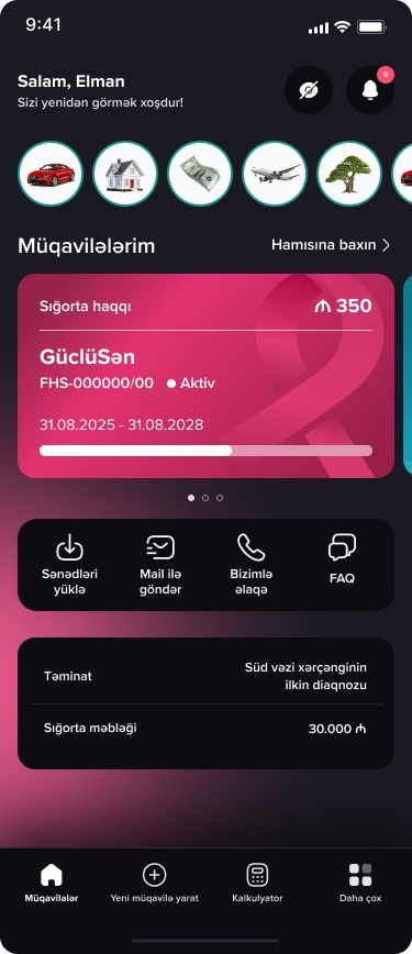
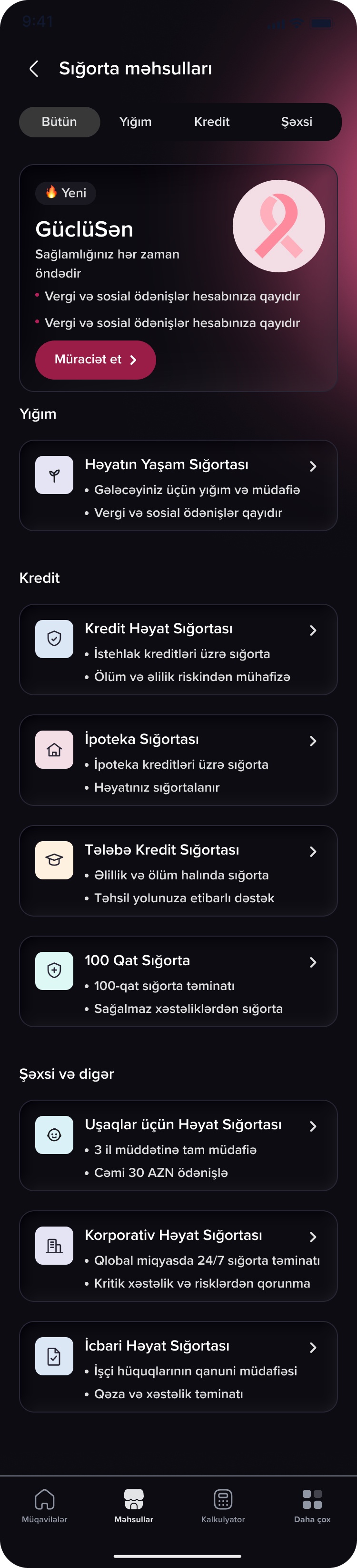
Interface text · Azerbaijani → English
The new UX solutions fully proved themselves in real analytics.
We see a steady and consistent growth in the number of active users (MAU/DAU).
The new architecture made it easier for users to discover and use other insurance products.
active users from our other products
01
İcbari Həyat Sığortası
active users
02
Korporativ Həyat Sığortası
active users
03
İpoteka Sığortası
active users
04
100 qat sığorta
active users
05
Kredit Sığortası
active users
06
Fərdi Həyat Sığortası
active users
Data as of 6 November 2026