Cashmate — Expense Tracker App
- Category
- Mobile App · Fintech
- Year
- 2023
- My role
- Product Designer — research, UX and UI
- Team
- Solo project
- Platform
- Mobile app (iOS)
- Scope
- User research, user flow, wireframes, design system, UI design and an interactive prototype
- Result
- A complete product design — from interviews to a clickable prototype and a component library
About
A calm way to see where your money goes
Product
Cashmate is a mobile app that helps people manage their personal finances: spending categories, spending statistics, financial goals and more.
Goal
The goals were to do thorough research first, and then to create a modern, user-friendly interface based on it.
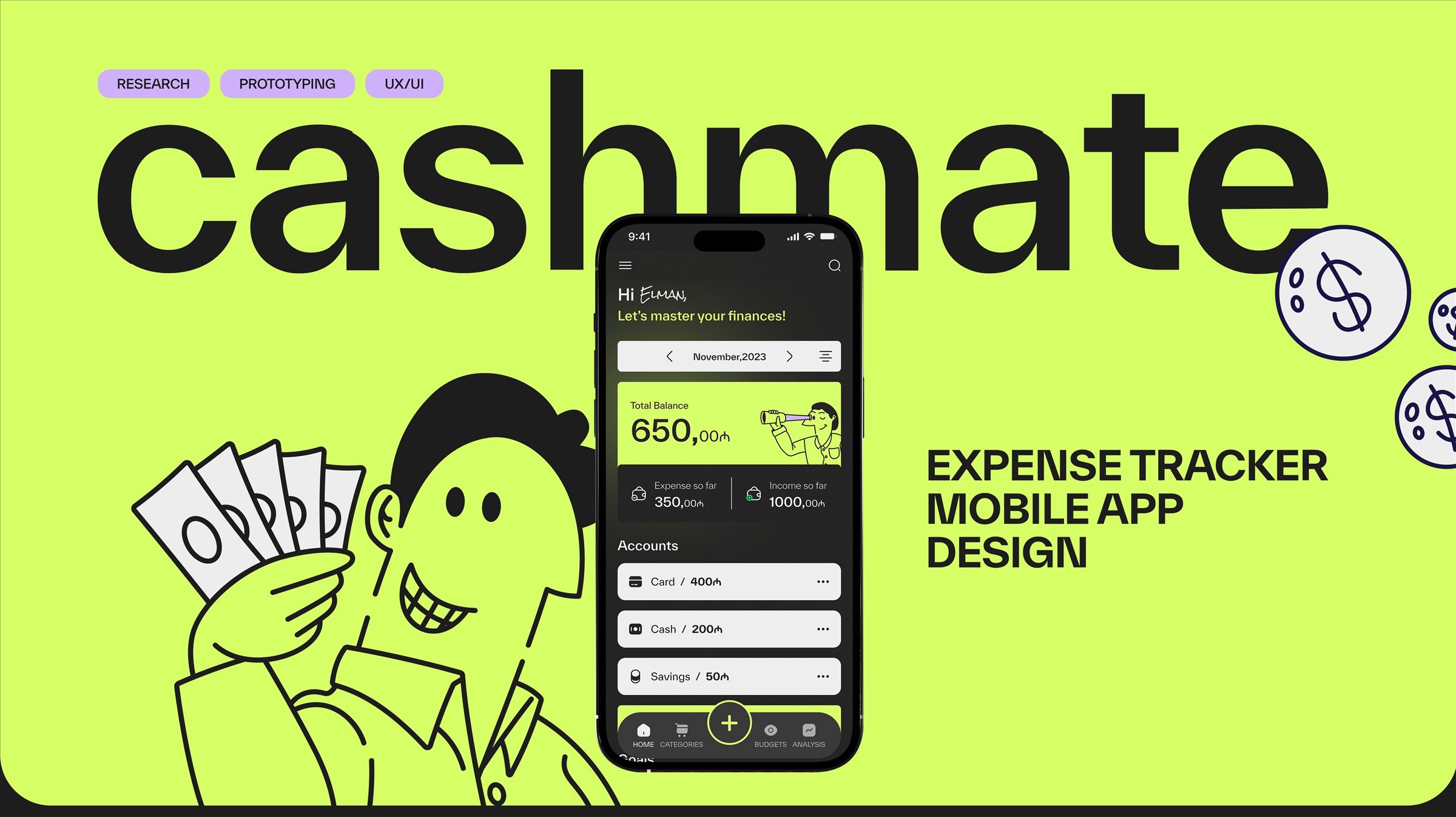
Cashmate — expense tracker mobile app design.
Design Process
Four stages, from questions to a tested prototype
Research
User audience, interviews, jobs and user stories, competitive and functional analysis, and a moodboard.
Prototyping
A functional prototype, the user flow and wireframes.
UI design
Visual concept, design system, component library, animation and an interactive prototype.
Testing
User testing and final corrections.
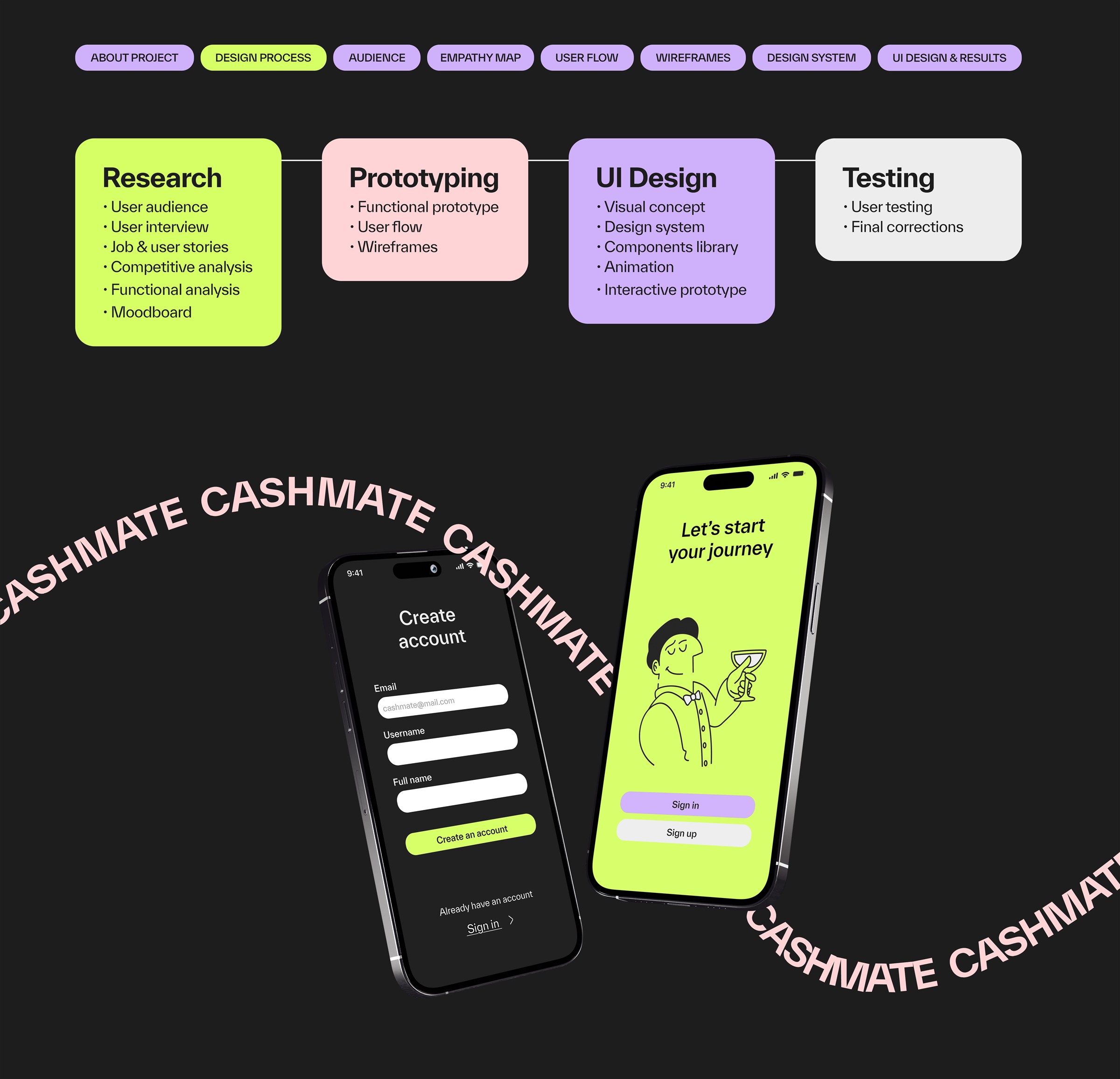
The design process.
Audience
People who cannot keep track of their money
Who
The audience is wide: almost everyone who handles money, roughly 15 to 65 years old. What unites them is that, for different reasons, they cannot keep track of their finances.
Aygun, 26
A teacher who keeps a digital record of her expenses and logs income at the end of each month. She wants category balances on the home screen, charts and motivating goals.
Fuad, 30
A banker who calculates his income at the end of each day. He wants notifications and daily limits, sometimes forgets to record expenses, and finds apps hard to understand.
Keywords
From the interviews, three words kept coming back: clear, simple, notice.
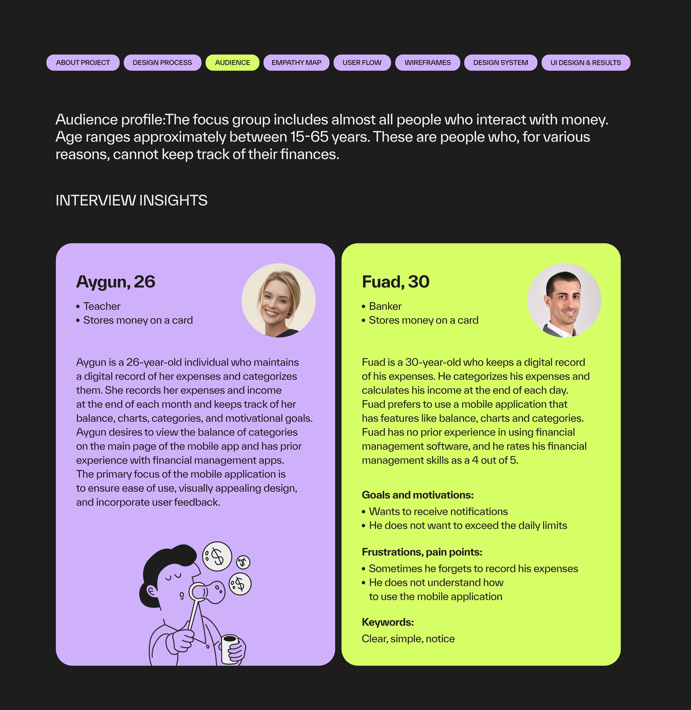
Interview insights — two profiles.
Empathy Map
What they say, think, do and feel
Says
"Keep it simple and clear." "I would like to view my account balance on the home page."
Thinks
It would help to get a notification when the limit is exceeded, and to see a breakdown of where the money is mostly being spent.
Does
Deleted an app because he did not understand the interface. Spends a lot on things that are not really needed.
Feels
"Where did the money go?" — disappointed that he does not understand. At times too lazy to jot down notes.
Insight
Three needs came out of it: clarity, a fast way to record, and gentle control through limits and notifications.
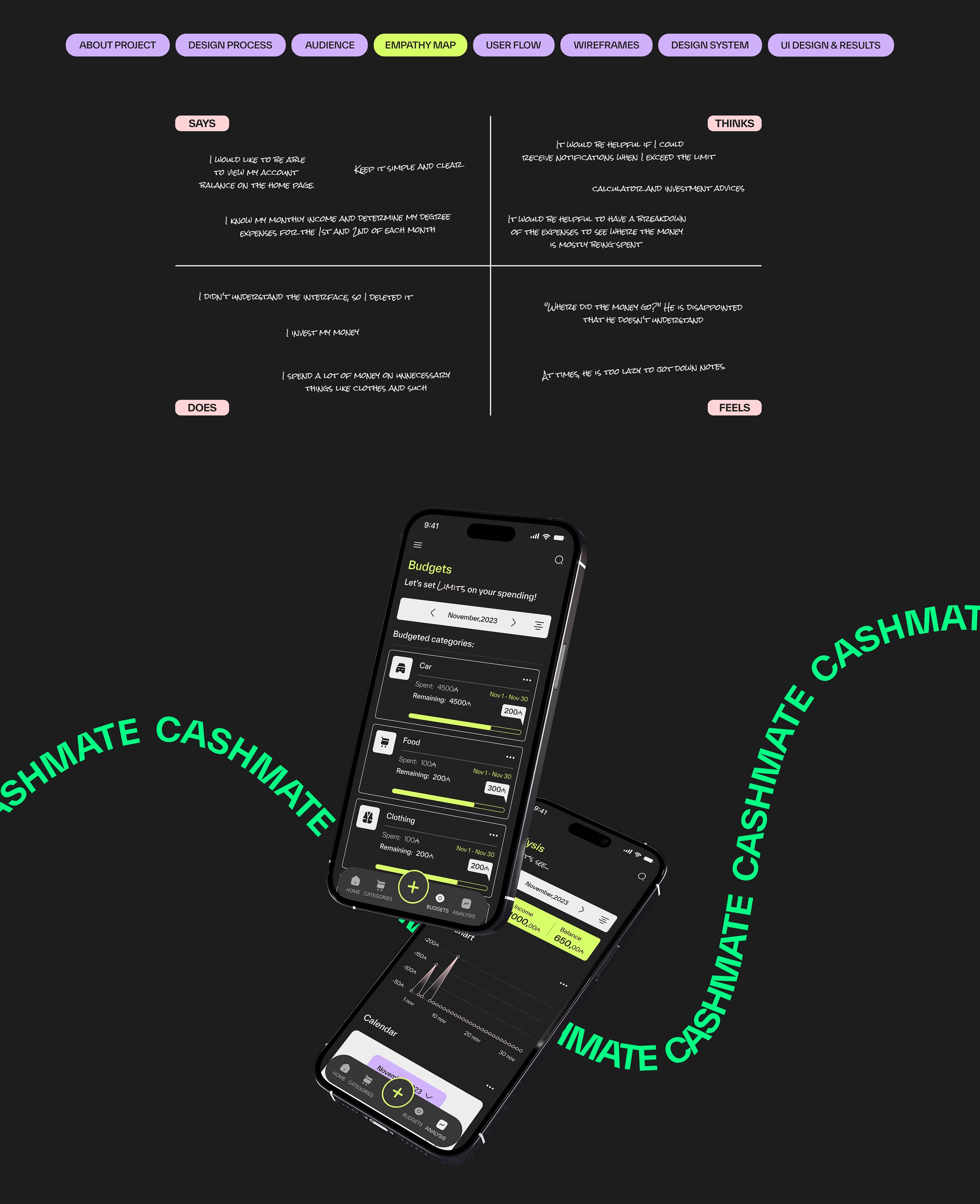
Empathy map, and where it led: Budgets and Analysis.
User Flow
A structure that fits in one tab bar
Entry
Onboarding leads to sign in or sign up — by e-mail or social media — with an error state for a failed sign-up.
Four areas
Home (accounts, goals, records), Categories, Budgets and Analysis (expense and income overview, expense and income flow, account analysis).
Decision
Everything needed day to day is one tap away, and adding a record is always reachable from one central "+" button.
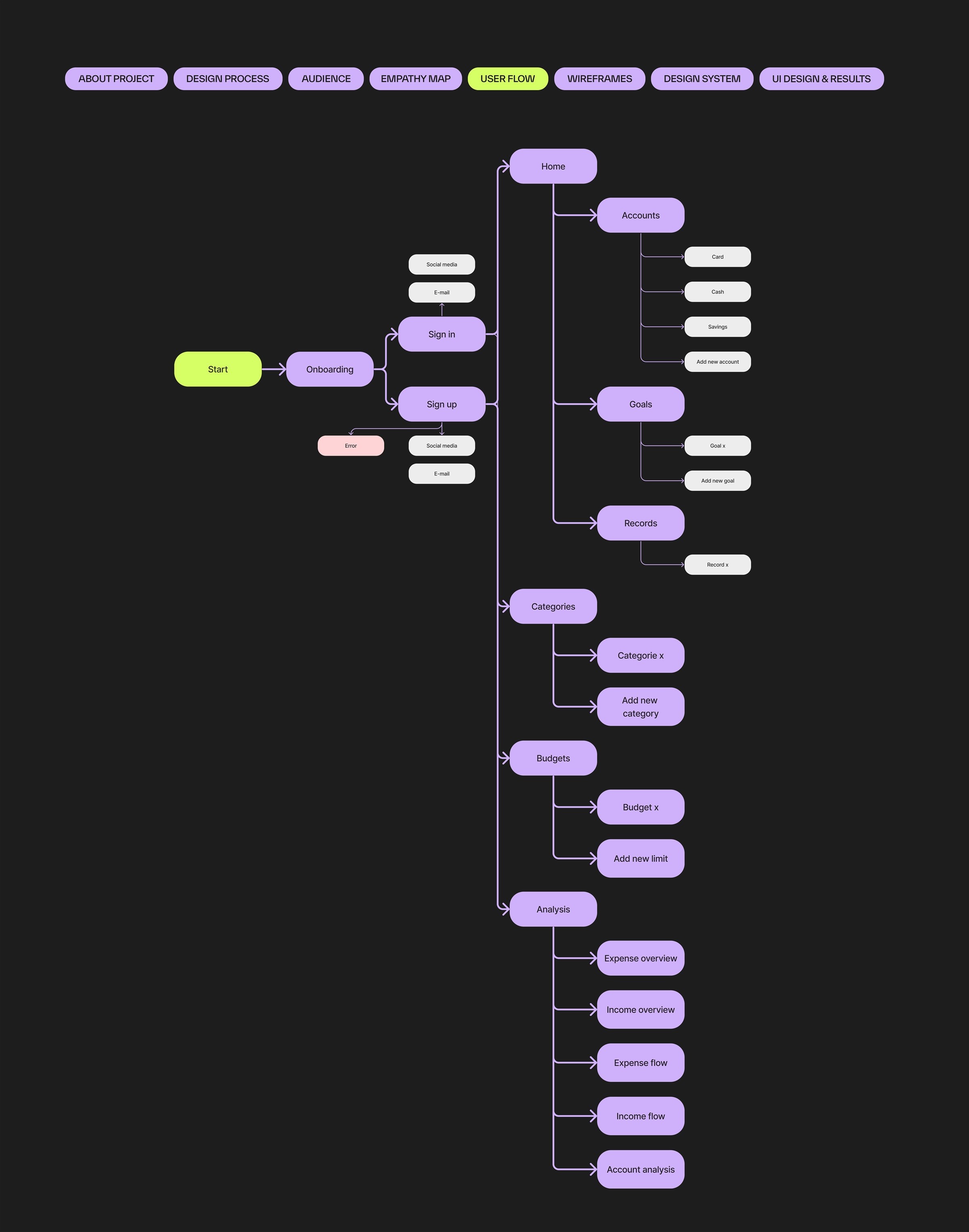
User flow.
Wireframes
Low-fidelity screens to settle the structure
Quick entry
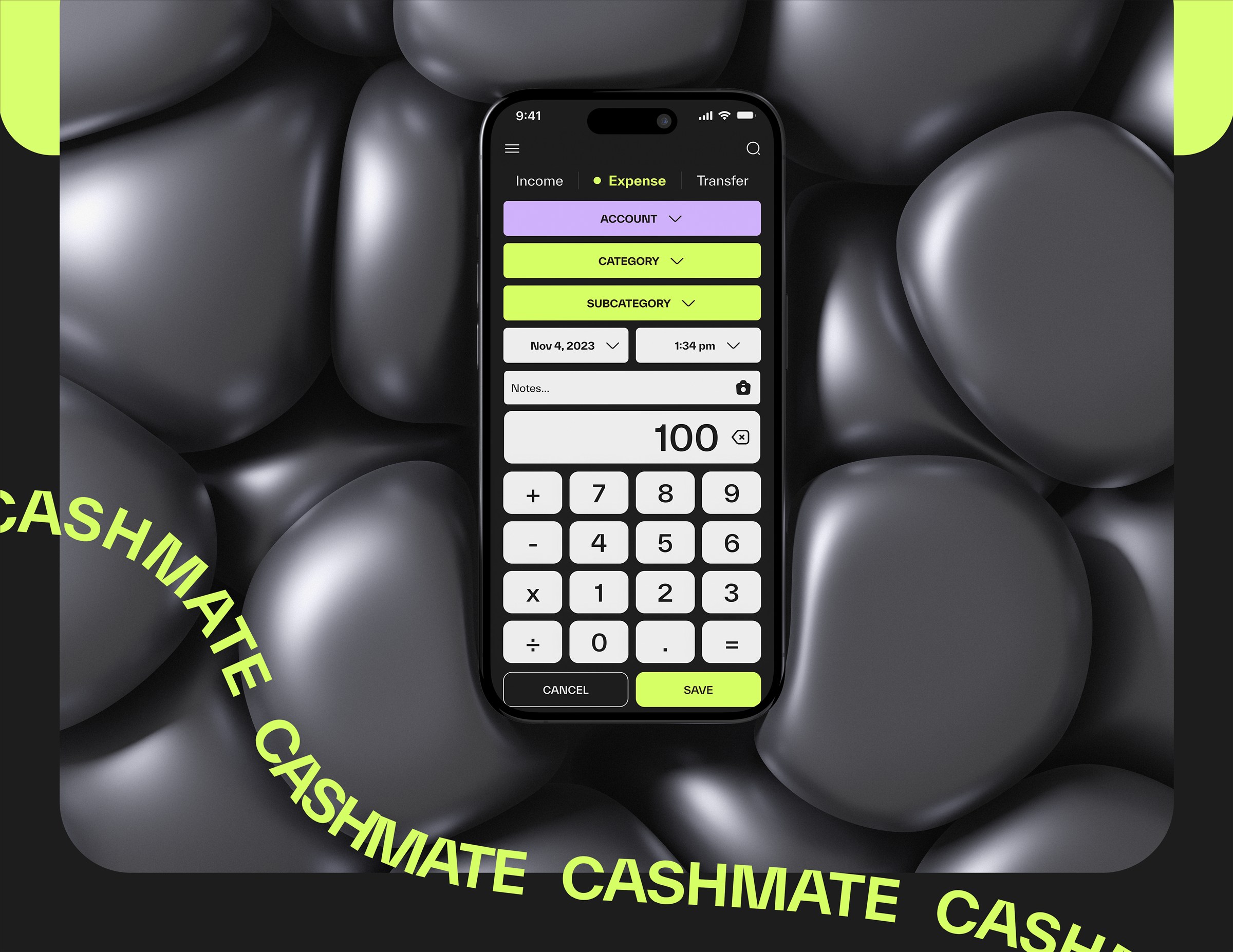
Adding a record is a calculator-style keypad, with account, category, date and notes above it — numbers are entered the way people already type them.
Analysis
One analysis screen with a switcher between expense overview, income overview, expense flow, income flow and account analysis.
Budgets
Budgeted categories with progress bars, plus a separate list of the categories that have no budget yet.
Around the core
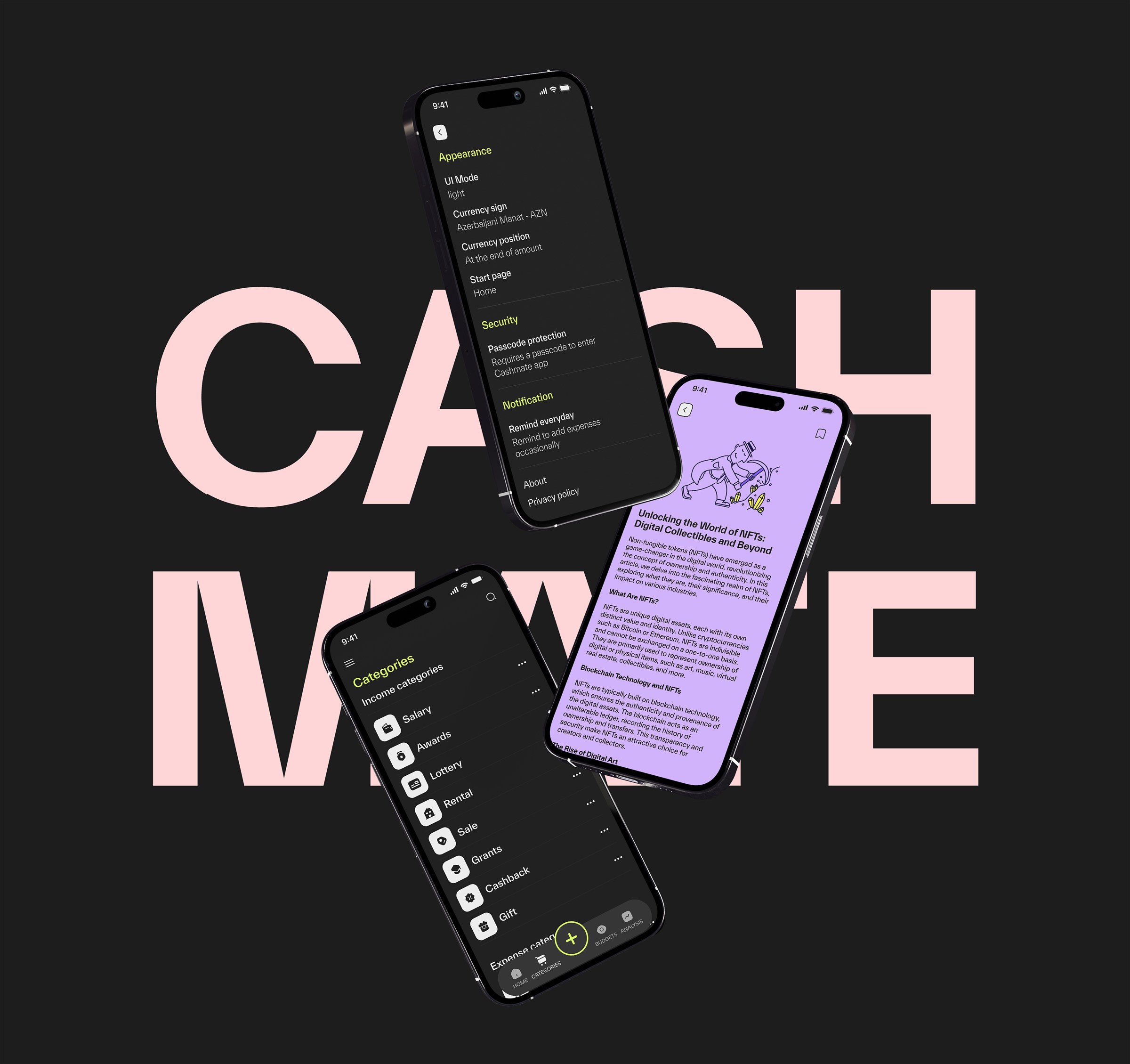
Settings for appearance, security and notifications, and an article screen for financial education.
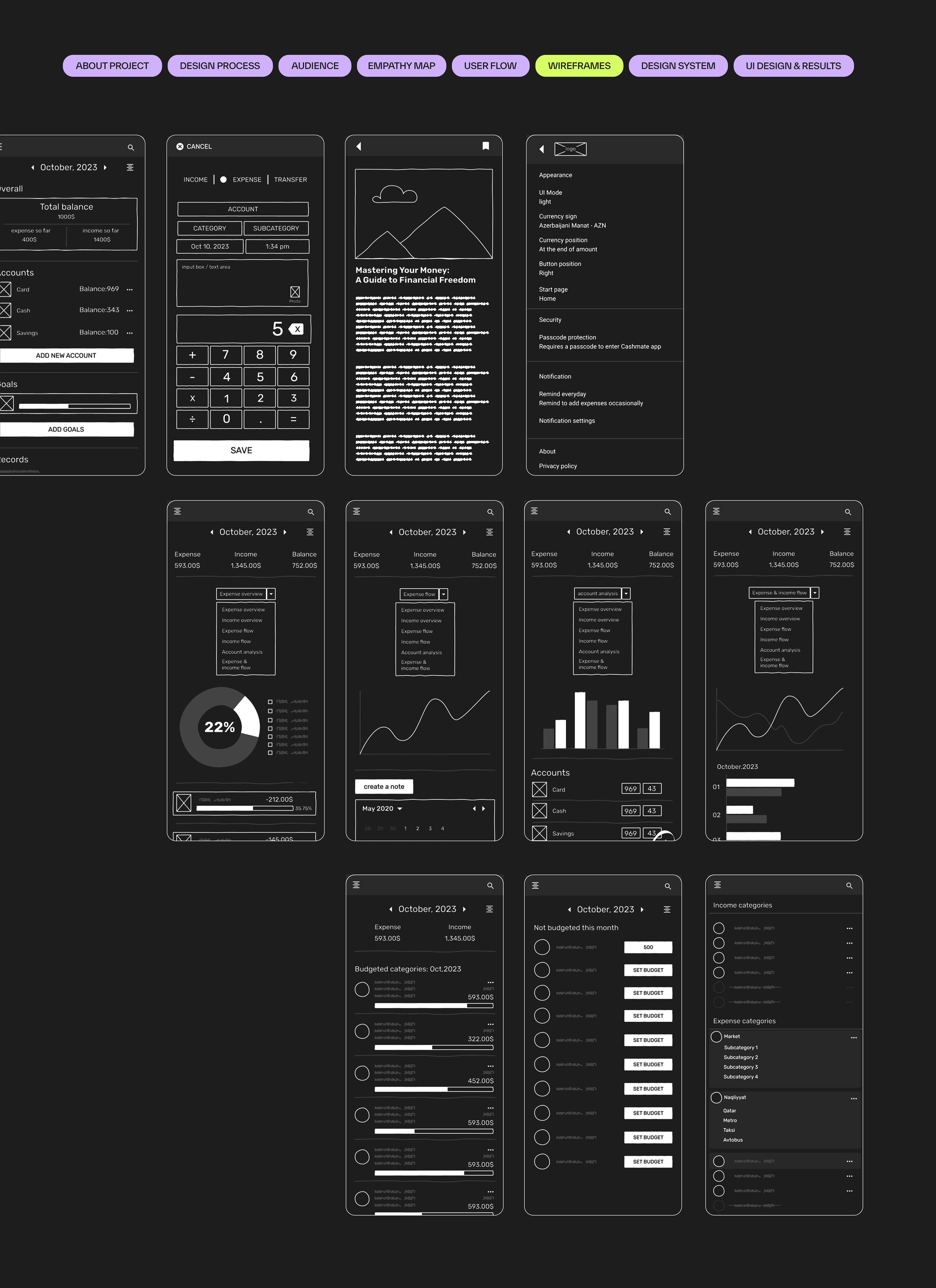
Wireframes — the structure of every screen.
Design System
A small, flexible system with lime at its center
Color
A near-black base with lime for primary actions and lilac, mint and pink as accents.
Typography
A seven-step type scale, from 32 pt bold headings down to 10 pt overlines.
Components
Buttons in default, pressed and disabled states, social sign-in buttons, chips, a tab bar with a central action and an icon set in active and inactive states.
01 · Color
Ink
#1C1C1C
Background, text on light
Lime
#D9FF66
Primary actions
Lilac
#CFB5FB
Secondary actions
Mint
#B3FFC0
Accent, positive
Pink
#FFD6D6
Accent, soft
Light
#EEEEEE
Fields, keys, text on dark
02 · Typography
- H1 — Master your finances32 pt bold
- H2 — Master your finances28 pt bold
- H3 — Master your finances25 pt bold
- Subtitle — Master your finances18 pt bold
- Body — Master your finances16 pt bold
- Caption — Master your finances12 pt regular
- Overline — Master your finances10 pt regular
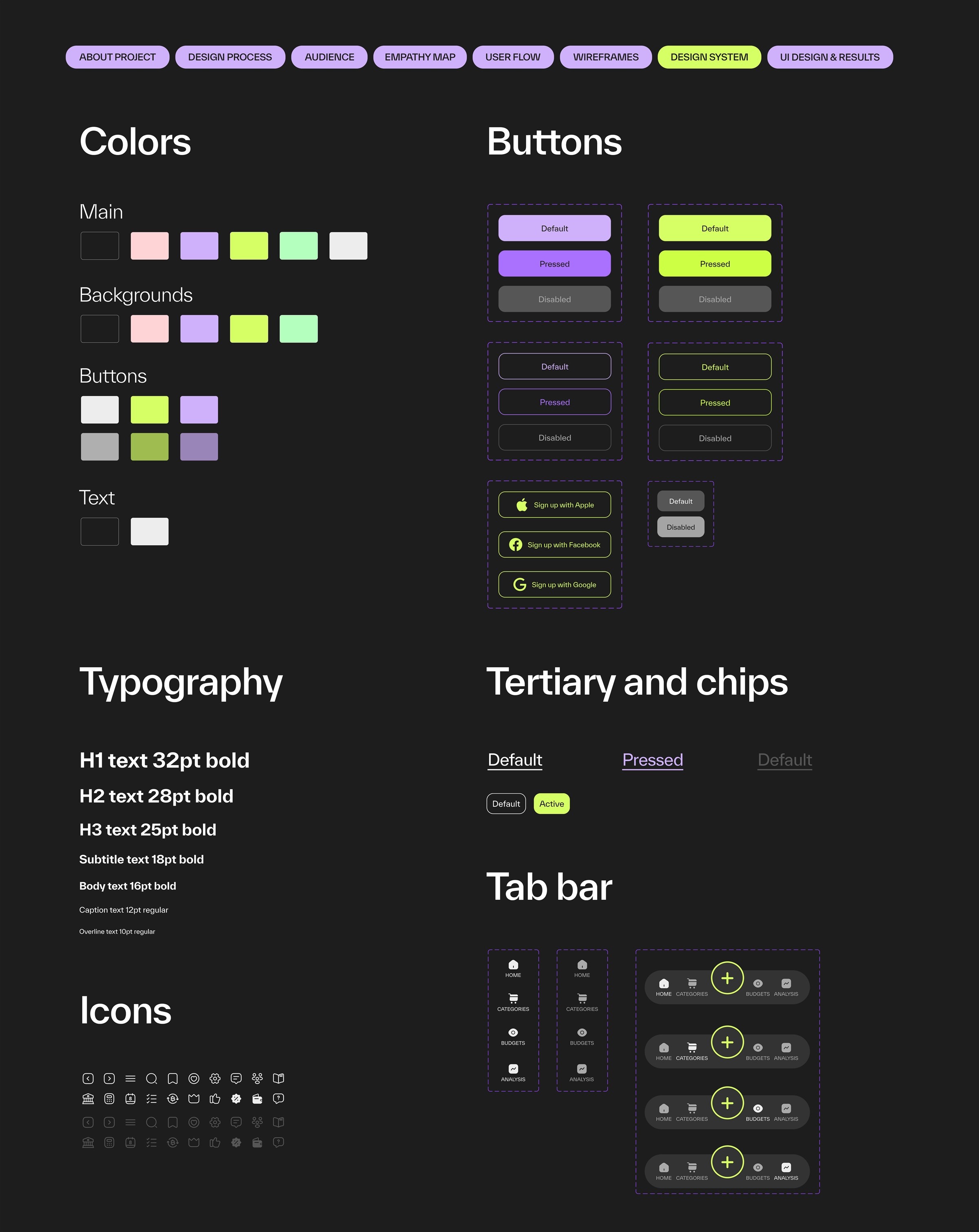
The design system sheet.
Visual Concept
Friendly, bold and a little playful
Concept
A near-black base with lime, lilac, mint and pink. Hand-drawn line illustrations make a serious topic feel friendly.
Onboarding
Three colorful steps lead into a calm, dark sign-in screen — the app is playful on the way in and focused once you are in.
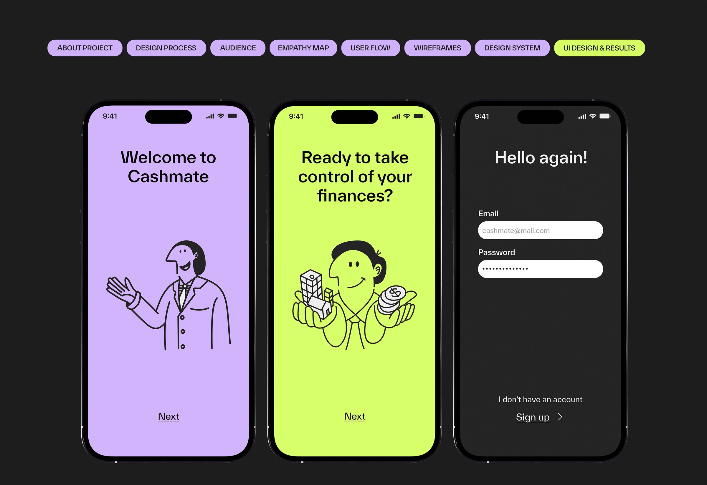
Onboarding and sign-in.
Quick Entry
The core loop: add an expense in seconds
Why it matters
Fuad forgets to record expenses, and Aygun logs hers only once a month. If recording is slow, it does not happen.
How
The keypad sits at the bottom, in thumb reach, with Save right next to Cancel.
The core loop
Type it like a calculator, see it everywhere.
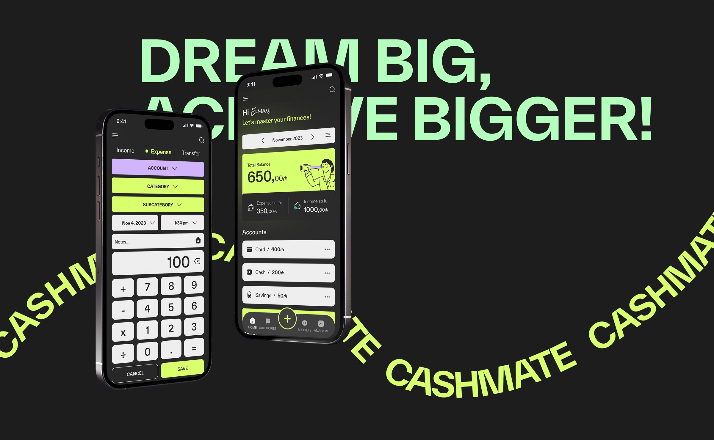
Adding an expense takes one screen and a keypad. The moment it is saved, the balance, the expense total and the account all move together.
Add an expense.
Screens
Home, explore, categories and settings
Home
A lime balance card with an illustrated spyglass, expense and income so far, and the accounts right below.
Explore
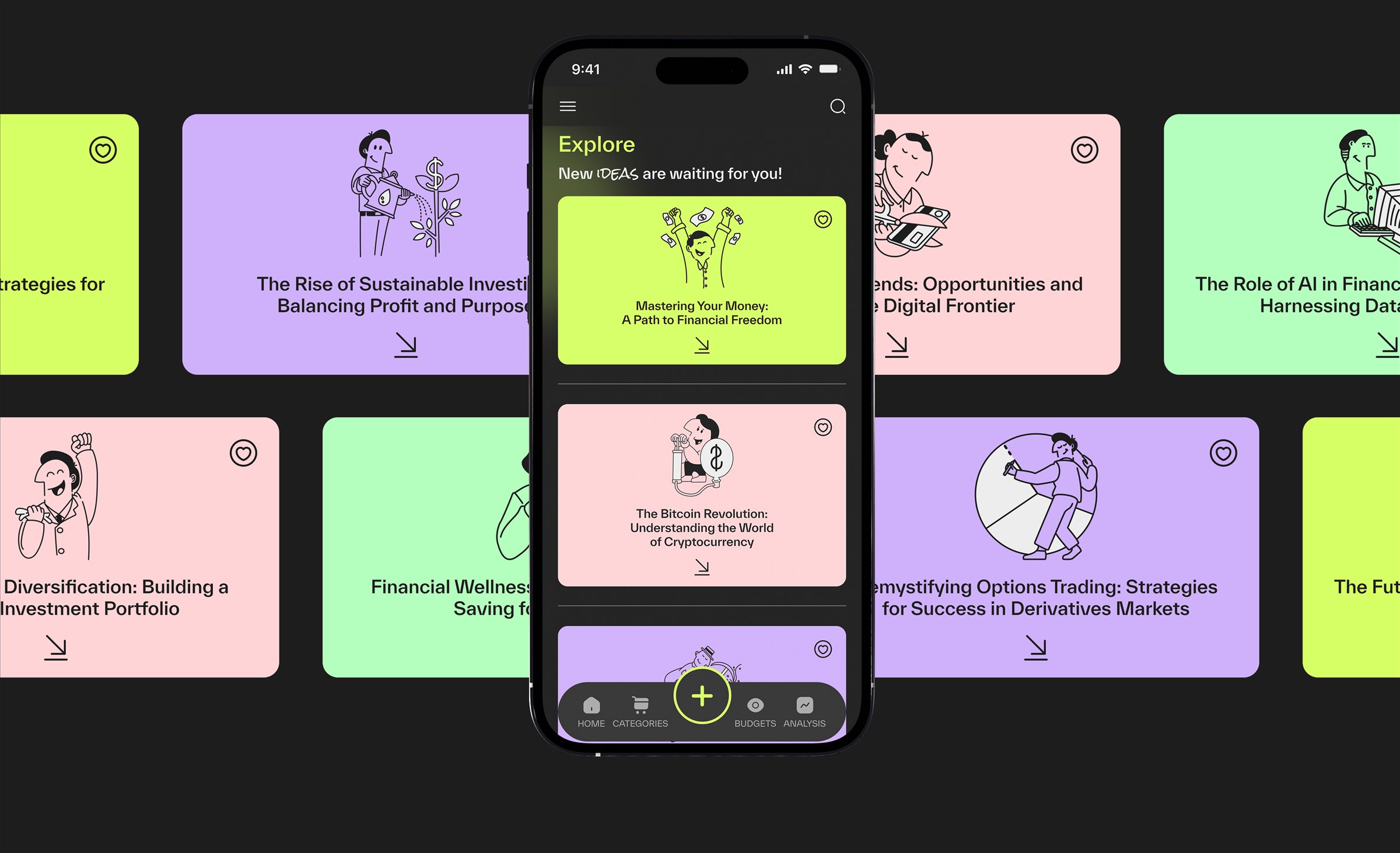
A small educational feed about investing, crypto and NFTs, so the app teaches as well as tracks.
Categories & settings
Income and expense categories with subcategories, and settings for currency, start page, passcode and reminders.
Add an expense and see the balance
Explore — new ideas are waiting
Settings, article and categories
Final Screens
The full set, together
Result
A complete set of screens — onboarding, sign-in, home, categories, quick entry, budgets, analysis, explore and settings — all built from one system.
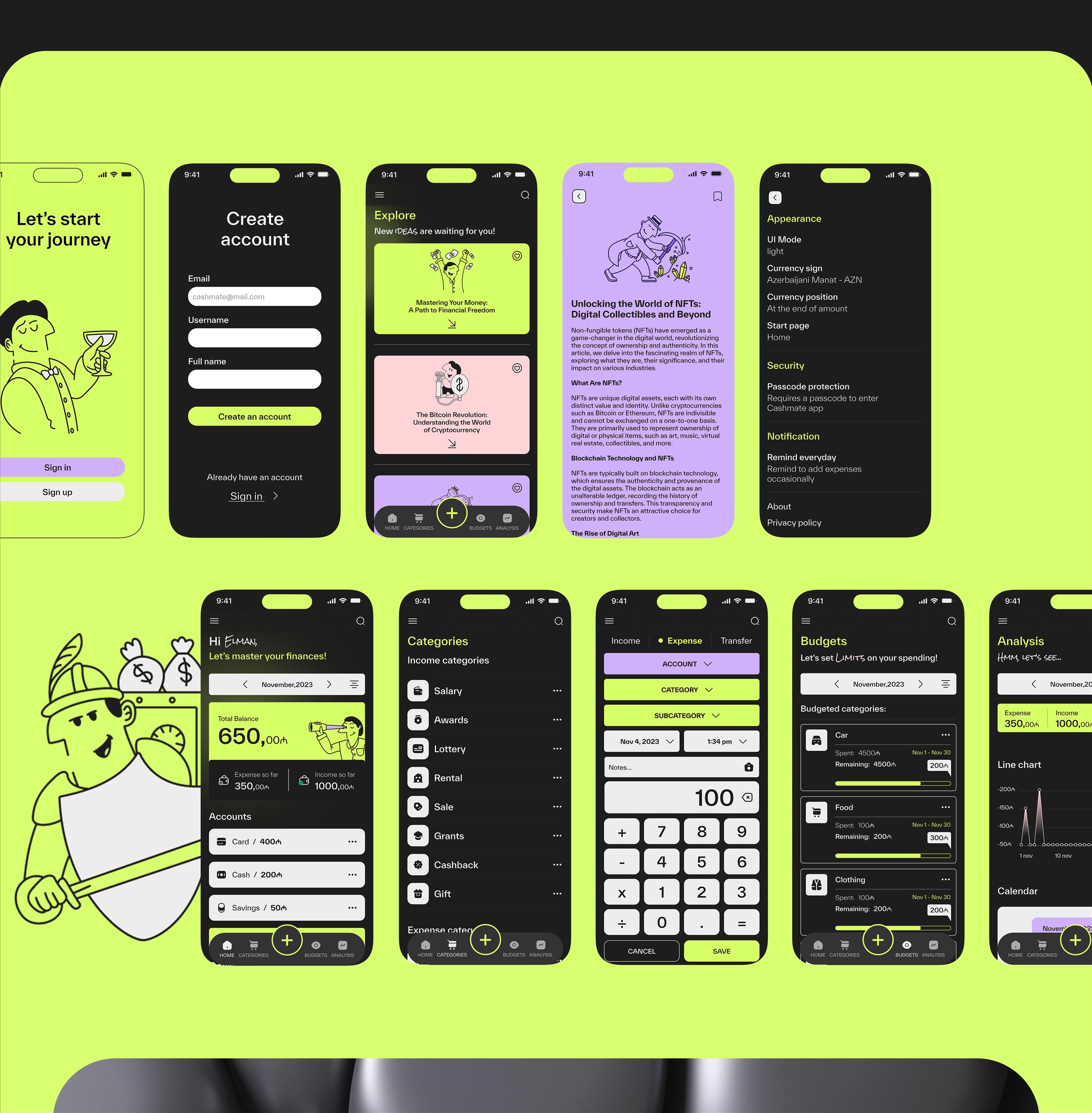
Final screens.
Reflection
What I delivered and what comes next
Delivered
Research with interviews and an empathy map, a user flow, wireframes, a design system with a component library, the final UI and an interactive prototype.
Learned
Simple wins. Both people I talked to asked for the same thing in different words: less effort to record, more clarity about where the money goes.
Next
Test the prototype with more people, work out the notification and limit logic that Fuad asked for, and try the light theme that the settings screen already points to.